Peter Linderoth, would like to offer you some skittles. Not the candy, though the ones he has in mind are also little digestible bursts of color. These skittles, though, are no empty calorie confection. They’re packed with substance. And, if you care about water quality in Long Island Sound and the rivers and streams that feed it, they’re actually good for you.
“Creating awareness about Long Island Sound conditions is really important,” said Linderoth, director of water quality for Save the Sound. “So, we’re taking technical information and breaking it down into a something most people are going to be able to pick up and readily understand.”
Think of Linderoth’s skittles as data bites, served not in a bag but sprinkling the margins of Long Island Sound maps in Save the Sound’s water quality reports. Each circle comes in one of five colors representing the full range of water quality grades, from A (grass green) to F (fire engine red). In the biennial Long Island Sound Beach Report, the skittles paint a concise, user-friendly picture of water quality at more than 200 public and private beaches (find the most recent Beach Grades available on soundhealthexplorer.org/swimmable/). Those data are collected by local health departments; Save the Sound converts them to grades.
The skittles in the Long Island Sound Report Card, on the other hand, display the ecological health of bays and harbors around the Sound. Report Card Bay Grades are based on data gathered during the Unified Water Study’s six-month monitoring season, which runs from May through October each year. Also published biennially, the 2022 Report Card is available at soundhealthexplorer.org/fishable/; the 2024 report will be released this fall.
“We get a lot of feedback that our reports provide important information pertaining to the environmental health of the Sound and put things into perspective,” said Linderoth. “They make the data accessible.”
Inaccessibility is one of the biggest obstacles in communicating scientific data to the general public and thereby maximizing their utility. People may be interested in water quality, but that doesn’t mean they know when dissolved oxygen levels threaten marine life. Essential data exists—this year, 27 groups are monitoring 46 bays and harbors for a range of indicators including dissolved oxygen, Chlorophyll a, dissolved organic carbon, and water clarity. But for data to lead to action, stakeholders must understand the story the data are telling.
Hence, the maps and the helpful skittles. It’s not unlike the analytics boom in baseball that began with Michael Lewis’ Moneyball. Perhaps only data scientists and statistics-minded baseball fans could embrace a book that delves into the value of combining a hitter’s on-base percentage with his slugging percentage. But then they made the book into a movie, and Brad Pitt became the face of data analytics. Suddenly, data had everyone’s attention.
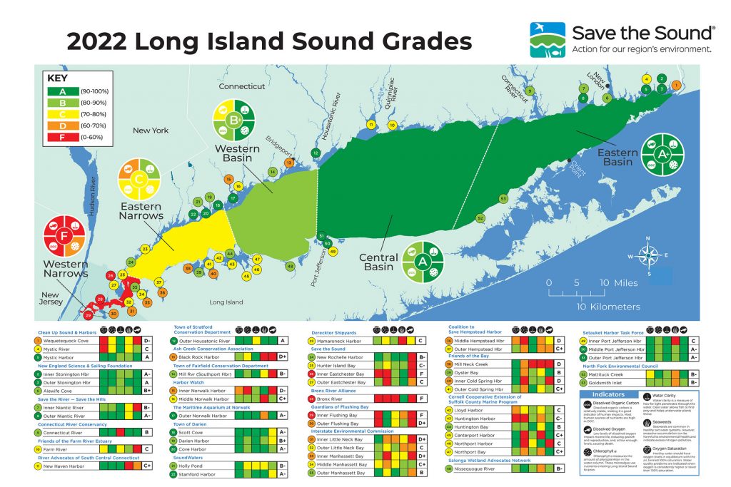
The dark green areas on this Long Island Sound Report Card designate good water quality. ©savethesound.org
Data visualization in water quality reports works the same way. Colorful dots catch someone’s eye. That could prompt an exploration into the “why” behind a particular grade, which in turn could lead to action to address the source of the problem that led to that grade.
Or it could lead to help on a grander scale. Ten days after Save the Sound released its 2020 Long Island Sound Report Card, Connecticut’s U.S. Senators Richard Blumenthal and Chris Murphy delivered a letter to the Committee on Appropriations highlighting that more than half the bays in the Report Card received “low water quality scores.” Letters like these can help secure additional funding for the EPA’s Long Island Sound Study, which would benefit bays and harbors around the Sound.
And when restorative actions are taken, water quality improvements will be marked in a progression of colored circles.
You can’t tell whether the water in Bridgeport’s Black Rock Harbor is getting healthier just by looking at it, but once the massive overhaul of the city’s wastewater treatment plants is further along its projected 12-year timeline, you should see the skittles change from orange to yellow and, maybe one day, into greens. You’ll be able to track the upgrades in Northport Harbor the same way, as aging cesspools and septic systems are replaced by newer technologies that remove more nitrogen, made possible by the Suffolk County Septic Improvement Program.
“The data will show that the actions taken actually are leading to improvement in water quality in these harbors,” said Linderoth. And the skittles will tell that story. ■
Save the Sound works across the Long Island Sound region to protect the Sound and its rivers, fight climate change, save endangered lands, and work with nature to restore ecosystems. More info at savethesound.org.